278 – Global wealth inequality
The charity Oxfam recently released a remarkable report on international wealth inequality. Based on data and analysis published by the Swiss financial company Suisse Credit, they highlighted that the aggregate wealth of the world’s richest one percent of people is about the same as the aggregates wealth of the other 99 percent.
This made my head spin, so I wanted to see the graph of wealth distribution. Using the Oxfam/Suiss Credit data, I put together an approximation of the Lorenz Curve for the whole world (Figure 1). To create a Lorenz curve, you rank all the people, from poorest to richest, and plot the proportion of the world’s wealth that they own. The graph shows the proportion of the world’s wealth that is owned by the poorest X percent.
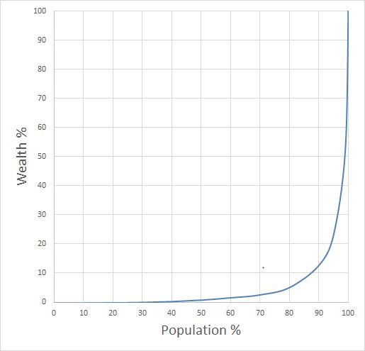
Figure 1. The percentage of the world’s wealth that is owned by the poorest X percent of the population.
The figure reinforces the remarkable extent of inequality indicated in the headline 1%:99% fact.
For example, it shows that the least-wealthy 70% of people own just a few percent of the world’s wealth between them.
90% of people have a bit more than 10% of the wealth.
The wealth of the bottom 30% is roughly zero. If you look closely, you can see that the line disappears below the axis for the bottom group of people, indicating that they have slightly negative wealth.
At the other extreme, the wealth of the very richest people is astounding. You can’t make this out on the graph, but the richest 80 people in the world – with individual wealth ranging from $13 billion to $76 billion in 2014 – have as much wealth between them as the bottom 50% of people on the planet. That’s 80 people versus 3,500,000,000 people.
However, you might be surprised to learn that the story of the richest 1 percent is not all about billionaires, or even millionaires. To make it into the richest 1 percent, you need wealth of about $800,000. There are 1.8 million such people in Australia. Those of us who live in Australia (or in any developed country) would come across top 1 percenters on a regular basis – they are all around us. They are mostly not people living a jet-set lifestyle. Within a developed-country context, most of them would not be considered especially rich.
That is even more true of the top 10 percent. The wealth you need to make it into that group is only $77,000. As one of my colleagues commented, this reveals that the problem is not “those rich bastards”. It’s us!
 This is not to say that the poor are not improving their lot. In many developing countries, the average wealth of poor people, and especially middle-ranked people, has improved over time (see here). It’s just that the wealth of people who are already wealthy is growing more rapidly, not just absolutely but relatively.
Another surprising result is that there are quite a few people from developed countries at the bottom end of the distribution. These are mostly people who have assets, and actually have a pretty good standard of living, but they also have large debts that leave them with negative net wealth. The collapse of house prices in the US associated with the Global Financial Crisis created many such people. Remarkably, about 7% of Americans are in the bottom 10% for net wealth. Only India has more people in this poorest group! Of course, this reveals that net wealth is not the whole story. An American from the bottom 10% is likely to have a much higher standard of living and much greater opportunities for improvement than an Indian from the bottom 10%.
The difficult thing, of course, is the question of what should be done about all this inequality. Oxfam has some proposals, but others have argued that inequality per se is not a problem, as long as the lot of the poor is improving. To me it seems that extreme inequality is a concern in its own right, particularly within a country, but that it would be hard to support measures to dampen inequality if doing so would make poor people worse off. This is a can of worms, of course.
Further reading
Bellù, L.G. and Liberati, P. (2005). Social Welfare Analysis of Income Distributions: Ranking Income Distributions with Lorenz Curves, IDEAS page.
Credit Suisse (2014). Global Wealth Data Book, online here.
Oxfam (2015). Wealth: Having It All and Wanting More, online here.
Whether between countries or within countries, once the methodological nit-pickers have said what they want, the brunt of the fact still remains, whichever way you look at it. We can land people on the moon and a spacecraft on a comet, split the atom and more, but we do not seem to be able to regulate ourselves – though of course “we” is an abstraction, the reality being more akin to “us versus them” or “me versus the ROW”. The key statement about “what can be done” is your next-to-last one: “It would be hard to support measures to dampen inequality if doing so would make poor people worse off”. This, I believe, is the crux of the problem.
There are two ways to look at this, which are not incompatible. One is from a fairness, equity or justice (FEJ) point of view. In this case, nothing much is likely to happen unless all involved perceive the solution as “fair enough” (literally). This is easier said than done, as different people or groups hold different perceptions of FEJ in different situations and, in addition, perceptions of FEJ are often polluted with “self-serving bias”. But it is possible, methodologically, to overcome this analytical problem: I have been working on this for some time, with some success.
The second way to look at it is purely from an “economic efficiency” point of view, which in this case translates mostly into potential for economic growth, even by as crude a measure as GDP. The OECD has recently (Dec. 2014) published a report highlighting the degree to which excessive inequality hinders economic growth. See in particular:
OECD (2014), “Focus on Inequality and Growth – December 2014”. This document as well as figures and underlying data can be downloaded via http://www.oecd.org/social/inequality-and-poverty.htm
Cingano, F. (2014), “Trends in Income Inequality and Its Impact on Economic Growth”, OECD SEM Working Paper No. 163, http://www.oecd.org/els/workingpapers
Whether from an equity or an (economic) efficiency point of view, there is much that an be done to move things forward. But will governments fund research in this area? I have been hardly surprised to experience first-hand how hard it is for an economics research project on equity to receive funding and how (relatively) easy it is to receive funding on research related to economic efficiency.
So what do you make of the discussions over the relationship between the rate of growth and inequality of wealth and income? I have in mind the recent IMF reports in particular.
Hi Neil. I presume your question relates to the book by Thomas Piketty, which was prominent in the news last years. I haven’t read the book, so my views are limited. The Economist provides what seems to be a nice summary of it here: http://www.economist.com/blogs/economist-explains/2014/05/economist-explains
Great article, Dave. It is excellent that the average wealth of poor people is increasing. I still think inequality is a concern. Wealth means power – in a few people’s hands. And there is the issue of disposable income. Many people may be rich in developed countries because they own their home which is worth a lot. But they may be struggling to buy food when the cost of living is high. Plus our happiness seems to depend more on relative wealth – relative to our next door neighbour. But that is an social issue.
Great article David, really enjoyed it, especially living currently in TGC (The Great Country)!
There was some of this wealth distribution discussed in the population dynamics documentary by Hans Rosling. Very interesting.
http://www.gapminder.org/videos/dont-panic-the-facts-about-population/
Dr. Pannell,
I have just come across your blog when searching for income inequalities (#278). Your plot is intriguing but I wished it was a little more interactive. However there are a few numbers that I can’t seem to make out. You state that the wealth of the bottom 30% is essentially zero. Assuming the current world population is 7.4 billion, 30% = 2.2E+09. The United Nations defines extreme poverty and estimates that 836 million live in extreme poverty (http://www.un.org/sustainabledevelopment/poverty/). I recognize that these are both estimates but the difference seems rather large. Any thoughts on the substantial difference between the two?
Terence L. Marsh, Ph.D.
Department of Microbiology and Molecular Genetics
Biomedical Physical Sciences
567 Wilson Road
Michigan State University
East Lansing, MI
Hi Terence. I’m not sure. It may have something to do with differences between income and wealth. The data I shows include people with reasonable income but so much debt that their net wealth currently is negative.
Thank you for nice information
Please visit our website: https://uhamka.ac.id/
nice and good information
In your opinion, what policy implications or societal changes could address the issues of wealth inequality as presented in the article?
Telkom University
That’s too big a question to answer in a brief comment.
In what ways does the author suggest that focusing on improving the well-being of the poorest might be more productive than focusing solely on reducing inequality?
I did not argue that it is more productive. I just observed that “it would be hard to support measures to dampen inequality if doing so would make poor people worse off”.
Are there more information regarding about this topic for us to research for? Thank you, Regard Telkom University
Are there more information regarding about this topic for us to research for? Thank you, Regard fisika
thanks for sharing Are there have any information? Fisika