406. Risk means probability distributions
In everyday speech, the word “risk” usually refers to the possibility of something bad happening. In the context of a business, like a farm, a more nuanced definition is needed. In some agricultural contexts, the everyday meaning could be relevant, but in others, not so much.
In the “possibility of something bad happening” version of risk, it’s as if there are two possible states of the world: a state where the bad thing happens and a state where it doesn’t. An example where that might be a semi-reasonable approximation of reality could be the risk of China reimposing an 80.5 per cent “anti-dumping and countervailing duty” on Australian barley – a de facto ban on imports of Australian barley – resulting in a modest reduction in the barley price received by Australian producers.
In reality, even this is not a simple risk with two possible outcomes, since the level of a re-imposed duty might be different from last time, and the precise consequences of any particular duty can’t be predicted precisely. But it’s true that there either is or isn’t a dumping duty in place, and in that sense, the risk is black-and-white.
For the purposes of decision making under risk, experts generally agree that the best available approach is that laid out in Decisions Theory. For a particular decision problem (e.g., what rate of nitrogen fertiliser should I apply to my wheat crop in a particular paddock?) this highly logical approach starts by asking several questions:
- What are the potential decisions options? (Which nitrogen rates are realistic options?)
- For one possible nitrogen rate that is being considered, what are the possible outcomes? (What yields and grain qualities might result?)
- What is the probability of each possible outcome (each yield/quality combination)?
- How good is each possible outcome from the farmer’s perspective? If profit is the only goal, how profitable would each yield/quality combination be for that nitrogen rate?
To tie all that together, the next step is to work through all the possible yield/quality outcomes, multiplying the profit for that outcome by the probability of that outcome, and adding them all up, giving the “expected” profit for that nitrogen rate (“expected” in the statistical sense of a weighted average).
Finally, you repeat that process for each possible nitrogen rate, and compare the results. The best rate is the one with the highest expected payoff. There are many potential nuances and complexities in this (e.g. the farmer’s goal might be more complex than just maximising profit), but that gives you a sense of the essentials.
This example of a fertiliser decision obviously involves risk as it’s not clear what the outcome will be when the decision must be made. The farmer could apply a high fertiliser rate but end up losing money because rainfall is far below average that season.
That last sentence sounds a bit like the everyday version of risk (the possibility of something bad happening), but there are many possible outcomes, ranging from very good to very bad and including every possibility in between. It would not be helpful to think about risk as a black-and-white issue for this decision.
The essential feature of risk in this example is that there are many possible outcomes and they have different probabilities of occurring. Together, the outcomes and the probabilities give us a probability distribution. That’s basically what risk means in Decision Theory.
Risk is a situation where there is a probability distribution of outcomes.
This works in an unusual case where there are only two possible outcomes (a bad outcome where a risky event occurs and a good outcome where it doesn’t). But it also works where there are many possible outcomes (good, bad and indifferent), or even combinations of outcomes for multiple risky variables (e.g. there could be both production risk and price risk at the same time), so it’s a far more flexible and useful approach.
To make the example more concrete, let’s put some numbers on it. The examples below are highly simplified, but they’ll illustrate the key ideas.
Table 1 shows probability distributions for three rates of nitrogen fertiliser applied to a wheat crop in a particular paddock in Western Australia, as perceived at the start of the season. There are obviously other possible rates, but I’ve kept it to three for simplicity. I’ve also simplified by increasing yield in steps of 0.2 tonne/ha. The way to think about this is that 1.2, for example, represents a range of possible yields between 1.1 and 1.3.
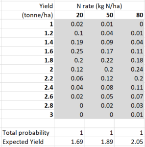
The values shaded in grey are the probabilities. For example, if 50 kg N/ha is applied, the probability of getting a yield of around 1.8 tonne/ha (i.e., between 1.7 and 1.9) is 0.22. One column of probabilities represents the probability distribution for a particular nitrogen rate. The probabilities add up to 1 down a column, which they have to do for these to be probability distributions. The expected yields (weighted averages) are shown in the bottom row. Although there is overlap between the distributions, the expected yield is highest for 80 kg/ha and lowest for 20 kg/ha.
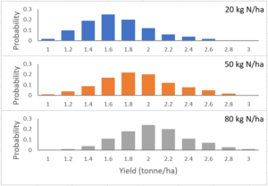
These distributions are shown in Figure 1. This makes it obvious that each of these rates is associated with risk. If you define the riskiness as the standard deviation of the distributions (how widely dispersed they are), the three rates in this example are not very different in their riskiness. I’ll look at how riskiness changes with different input levels in another post.
Assuming that the farmer aims to make money, the probability distributions in Table 2 are more relevant to decision making. They show the probability distributions (or sometimes I’ll just say “distributions”) of gross margin (a measure of profit) for the three nitrogen rates. These include the combined risks related to yield, grain quality, and output price. In this case, even though the highest N rate has the highest expected yield, it also has the highest fertiliser cost, so it doesn’t have the highest expected gross margin.
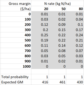
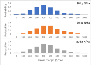
Again, those distributions are shown graphically in Figure 2. These illustrate a common pattern that varying an input such as N fertiliser doesn’t make a big different to expected profit. The range of possible gross margins in the distribution is far greater than the differences in expected gross margins between the different N rates.
Further reading
Ferris (J.N. (2017). Forecasting World Crop Yields as Probability Distributions, International Association of Agricultural Economists Conference, Gold Coast, Australia, August 12-18. Full paper here. Yield distributions are shown in Figures 1, 2 and 3 at the end of the paper.
This is #2 in my RiskWi$e series. Read about RiskWi$e here or here.
The RiskWi$e series:
405. Risk in Australian grain farming
406. Risk means probability distributions (this post)
408. Farmers’ risk perceptions
409. Farmers’ risk preferences
410. Strategic decisions, tactical decisions and risk
412. Risk aversion and fertiliser decisions
413. Diversification to reduce risk
414. Intuitive versus analytical thinking about risk
415. Learning about the riskiness of a new farming practice
416. Neglecting the risks of a project
418. Hedging to reduce crop price risk
419. Risk premium
420. Systematic decision making under risk
421. Risk versus uncertainty
422. Risky farm decision making as a social process
423. Risk aversion versus loss aversion, part 1
424. Risk aversion versus loss aversion, part 2
433. Depicting risk in graphs for farmers

Looks like you have been making up the data Dave!
True! 🙂
There will be real data in the next two posts in this series, though.