433. Depicting risk in graphs for farmers
There are many types of graphs that can depict the riskiness of a decision option. Here I present and comment on some of them. My aim is to provide some ideas and some guidance to people who wish to communicate with farmers about risk.
Farmers get shown a lot of graphs of the results of research or analysis, but mostly there is no representation of risk in the graphs. However, there are a number of reasons why depicting risk could be valuable for farmers.
- To convey the level of confidence they can have in the information
- To convey the variation in results that is likely to occur if they choose that decision option
- To help them weigh up the riskiness of different decision options
The most informative ways of conveying information about risk are probably graphs of various types. However, we know that many people have trouble reading graphs. For example, Galesic and Garcia-Retamero (2011) found that about a third of adults in the US and Germany have “low graph literacy”. That’s particularly a worry for graphs about risk because they are likely to be more complex and harder to interpret than many other graphs.
For that reason, my first piece of advice is to work hard to get the basics right when creating graphs to depict risk. That should include making sure that your graph is simple (or at least no more complex than necessary), clear and well-labelled. Axis labels and the figure caption should be accurate and complete enough to interpret easily, with text that is large enough to read easily, and with a good explanation in the accompanying text.
I suggest it is also a good idea to present the same risk information in multiple ways, if possible, because that increases the chance that at least one of them will connect with your audience.
Another thing that many people find relatively difficult to process is probabilities (Gigerenzer, 2002). That’s inconvenient! Risk is all about probabilities. While that’s true, it is sometimes possible to express information about risk in terms of frequencies or numbers of cases, which many people find easier to process. For example, …
“The probability of an outbreak of rust in your region this year is 0.2.”
… could be re-expressed as …
“In two years out of 10 years like this one in your region, there will be an outbreak of rust.”
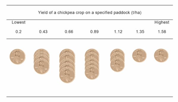
Having said that, in my experience, most farmers have a good intuitive understanding of probabilities and distributions, even if they don’t use those words. Using an approach based on frequencies rather than probabilities, my colleague Amir Abadi was able to elicit probability distributions of crop yields from a large sample of farmers (e.g., Figure 1).
Having laid that groundwork, here is a collection of graphs that depict an agriculture-related risk, with some commentary about each one from me.
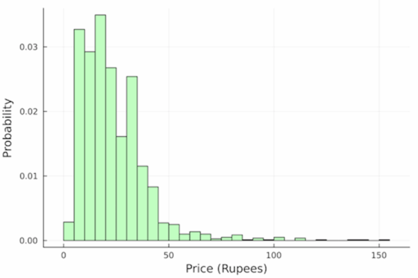
A histogram (Figure 2) has the advantage that it shows the whole distribution (the probabilities for all possible outcomes). Compared to some other options, it is relatively simple and clear. It can sometimes be presented as frequencies (Figure 1) rather than probabilities (Figure 2)
A closely related option is a cumulative probability distribution. Figure 3 shows an example from the software tool Fallow ARM. This shows the probability of any rainfall level up to some value. Although, technically, it contains the same information as an approach like Figure 2, in my opinion, it requires more mental work to unpack it enough to understand the probabilities of different values.
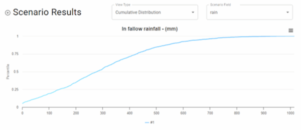
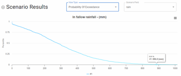
Figure 4 is the “probability of exceedance”, meaning the probability of getting more rainfall than a certain amount. It’s just one minus Figure 3, and I reackon it’s just as difficult to unpack.
On the other hand, Figure 5 is closely related to a cumulative probability distribution, but I reckon it’s easier to interpret. It shows the gross margin of particular fertiliser strategies for each of the 10 rainfall deciles. Rainfall deciles are probably more meaningful to farmers than probabilities in general, they are quite tangible, and the graph reveals something about the causes underlying the distribution of gross margins. On the other hand, this version of the graph only depicts risk arising from rainfall, and not other factors like prices. There are ways of adding those to the graph, but they probably increase its complexity.

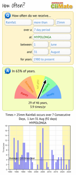
Figure 6 shows a screen grab from a tool called CliMate. The bottom graph shows how often a particular climatic event occurred each year over a run of years. This is clear and easy to understand. I like the way they have supplemented this with a half-dial that summarises the overall results in colours and simple words. Another option could be to create a histogram of the results.
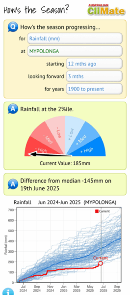
Figure 7, also from CliMate, shows how cumulative rainfall in the current year compares with previous years. Since rainfall is such a tangible thing, and farmers are aware that cumulative rainfall is the most important determinant of crop yield, this graph is likely to work better than a cumulative probability graph. But just in case it’s not easy for someone, they have provided another simple half-dial that summarises the overall results simply.
My final graph, Figure 8, shows the trade-off between risk (on the vertical axis) and reward (on the horizontal axis) when a farmer is choosing which of eight different crop rotations to use. This format requires us to state the riskiness of a rotation as a single number, in this case the probability of getting a gross margin below $50/ha. Economists creating this type of graph usually use the variance or standard deviation of the reward variable as their measure of risk, but I think that’s more likely to lose some farmers than a simple measure of the downside risk. Mind you, the risk variable in this graph is not ideal – it’s still a probability. Perhaps it could be stated as a frequency, although that might require an even longer description.
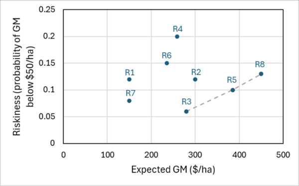
A powerful aspect of Figure 8 is that it makes it easy to identify which decision options are potentially worth considering and which can be ruled out. For example, compared with the rotation R5, it’s easy to see that there are four other rotations that are both more risky and less rewarding: R1, R2, R4 and R6. Using this type of thinking, we can see that the only options that need to be considered are R3, R5 and R8. Which of these three options will be preferred depends on a farmer’s attitude to risk.
Finally, what simple approach can we take for farmers who hate graphs. They might have to get their risk information in words alone. This probably needs something more than one or two words (as in Figures 6 and 7). A word-based description of a full probability distribution is probably a bit much for most people to take in. Perhaps that’s why a more common approach is to split the distribution into two parts – above and below a threshold level – and describe one or the other of those. For example, …
“There is an 80% chance that your crop yield will increase by at least 0.2 t/ha if you spray to control weeds now.”
That’s reasonably easy to understand, but this comes at a cost: it tells you nothing about the probability of getting any particular yield gain, just the probability of getting a gain of 0.2 t/ha or more. But that limited risk information might be better than no risk information.
Further reading
Abadi Ghadim, A.K. & Pannell, D.J. (2003). Risk attitudes and risk perceptions of crop producers in Western Australia, Risk Management and the Environment: Agriculture in Perspective, Kluwer, pp. 113-133.
Galesic, M. and Garcia-Retamero, R. (2011). Graph literacy: A cross-cultural comparison, Medical Decision Making 31(3), 444–457.
Gigerenzer, G. (2002). Reckoning With Risk, Penguin.
This is #18 in my RiskWi$e series. Read about RiskWi$e here or here.
The RiskWi$e series:
405. Risk in Australian grain farming
406. Risk means probability distributions
408. Farmers’ risk perceptions
409. Farmers’ risk preferences
410. Strategic decisions, tactical decisions and risk
412. Risk aversion and fertiliser decisions
413. Diversification to reduce risk
414. Intuitive versus analytical thinking about risk
415. Learning about the riskiness of a new farming practice
416. Neglecting the risks of a project
418. Hedging to reduce crop price risk
419. Risk premium
420. Systematic decision making under risk
421. Risk versus uncertainty
422. Risky farm decision making as a social process
423. Risk aversion versus loss aversion, part 1
424. Risk aversion versus loss aversion, part 2
433. Depicting risk in graphs for farmers (this post)

This shows how addressing information asymmetry through clear, farmer-friendly visuals can improve decision-making under risk. From a behavioural economics perspective, using clear visuals and framing risk in terms of frequencies helps counter biases like loss aversion and ambiguity avoidance. Overall, making information intuitive increases its usefulness in practical decision-making contexts.